A new face for Tigernmas, and why we kept the old one in view

When a company changes its logo, the temptation is to start again from nothing: new shapes, new colours, a new story. We decided against it.
The Tigernmas logo has been with us since the early days, when the company was a small marketing practice and the logo mostly appeared on invoices and e-mail signatures. It wasn’t perfect. Some details didn’t work at small sizes, the proportions had drifted over the years, and it had never been designed to stand next to other brands. But it was ours, and people recognised it.
Refine, don’t replace
So the brief was simple. Keep what people know, fix what doesn’t work, and make it ready for a company that now introduces several brands instead of offering one service. The result is a modernised version of the existing mark rather than a new one.
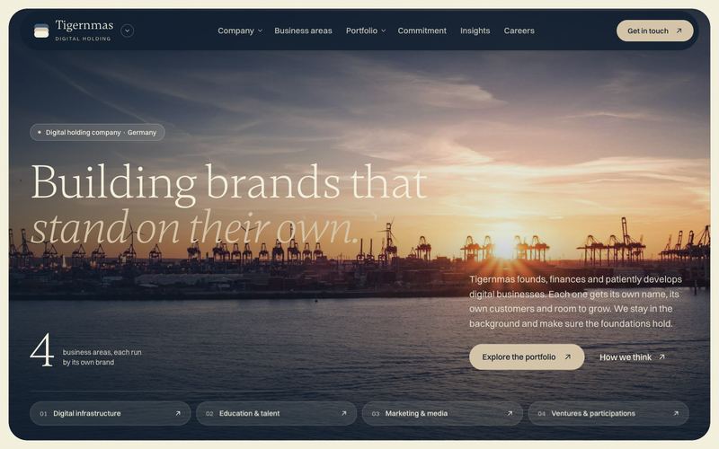
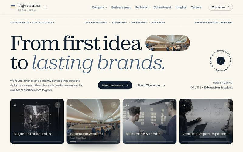
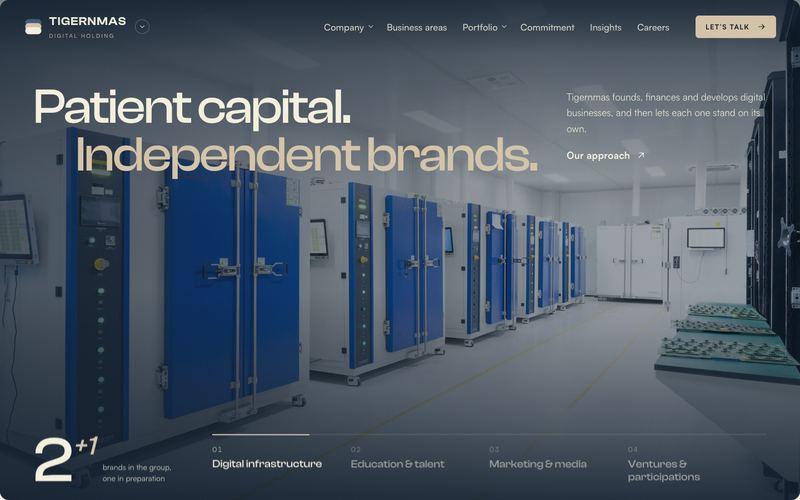
The colours follow the same idea. Deep navy for steadiness, a quiet slate blue, and warm sand and cream tones that stop the whole thing feeling cold. There are no loud accent colours. A holding company doesn’t need to shout. Its brands can do that for themselves.
The best identity work is often invisible. People simply find you easier to understand.
A website that introduces, not sells
The new website follows the same logic. It doesn’t sell anything, because Tigernmas doesn’t. It explains who we are, how we think and what we’re involved in, and then sends you on to the brands that actually serve customers.
We also made a few choices that don’t show up in screenshots:
- The site uses no tracking cookies and no analytics tools.
- Fonts and scripts are hosted on our own server instead of being loaded from third parties.
- If you’ve asked your device to reduce motion, the animations switch themselves off.
What stays the same
Everything that matters: the people, the principles, the brands. A new face, in other words, not a new company.